Loam
A two-sided marketplace, designed end to end
Loam is a mission-driven marketplace for sustainable, organic products. I led design on both sides: the shopper experience and the tools sellers use to run their storefronts, spanning the UX architecture, design system, and brand identity that holds them together.
It brings independent brands together across Wardrobe, Beauty & Wellness, Living, and Children: one trusted place for better-for-you alternatives. The harder problem sat beneath the storefront, designing the systems that let vendors join, list, and operate while the experience stayed cohesive and trustworthy as more sellers came on.
Understanding conscious shoppers
I studied how people discover and decide on sustainable products: what builds trust, what creates doubt, and where conventional marketplaces fall short.
Those signals pointed to an experience that leads with transparency and a tight edit, not endless choice. The goal: shoppers should trust that everything on Loam is good for them and for the Earth.
Structuring the marketplace before designing it
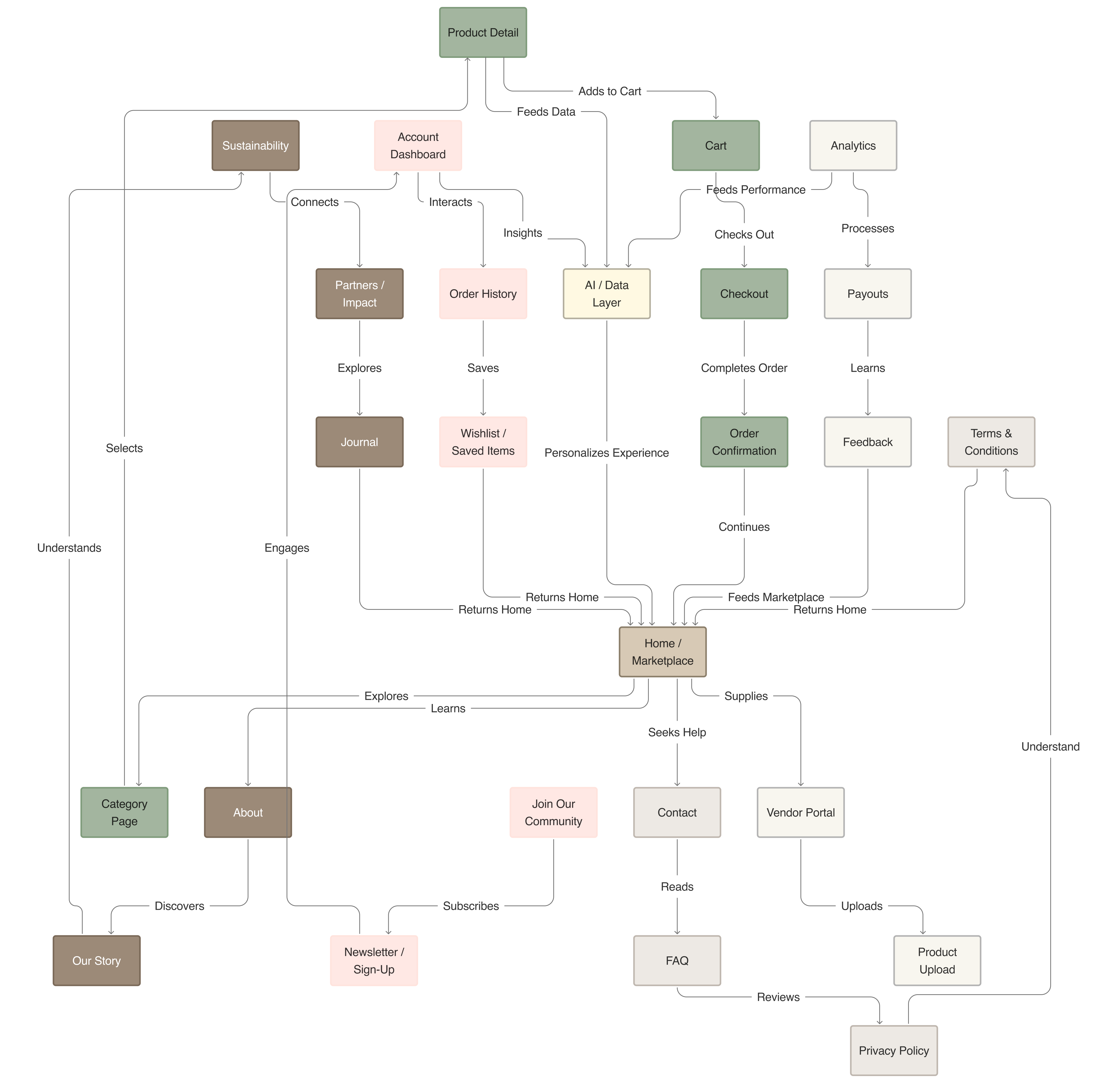
Before any visual design, I mapped the full marketplace: every page, how shoppers and sellers move through it, and how data flows between them.
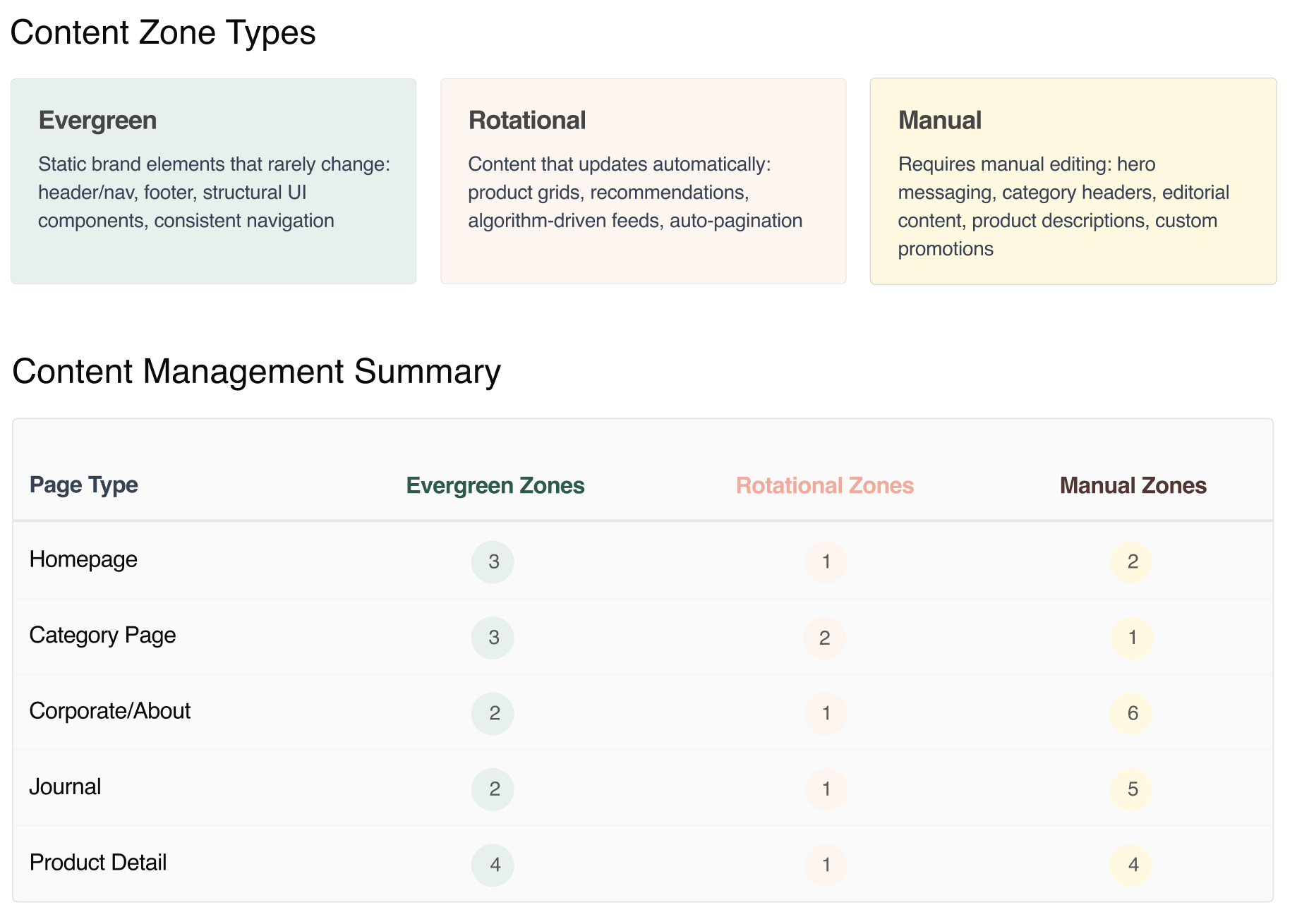
A content model for scaleThe hard part was holding a large, multi-vendor storefront together without a large team behind it. So I built the content model around three zone types, each defined by how often its content changes and who owns it. Most of the site updates itself, freeing people to focus only where real judgment is needed.
Applying the model to every pageI applied the model to every page type. Homepage, category, product, corporate, and journal templates all draw from the same zones, so each layout could be blocked out as structure before a single visual decision.
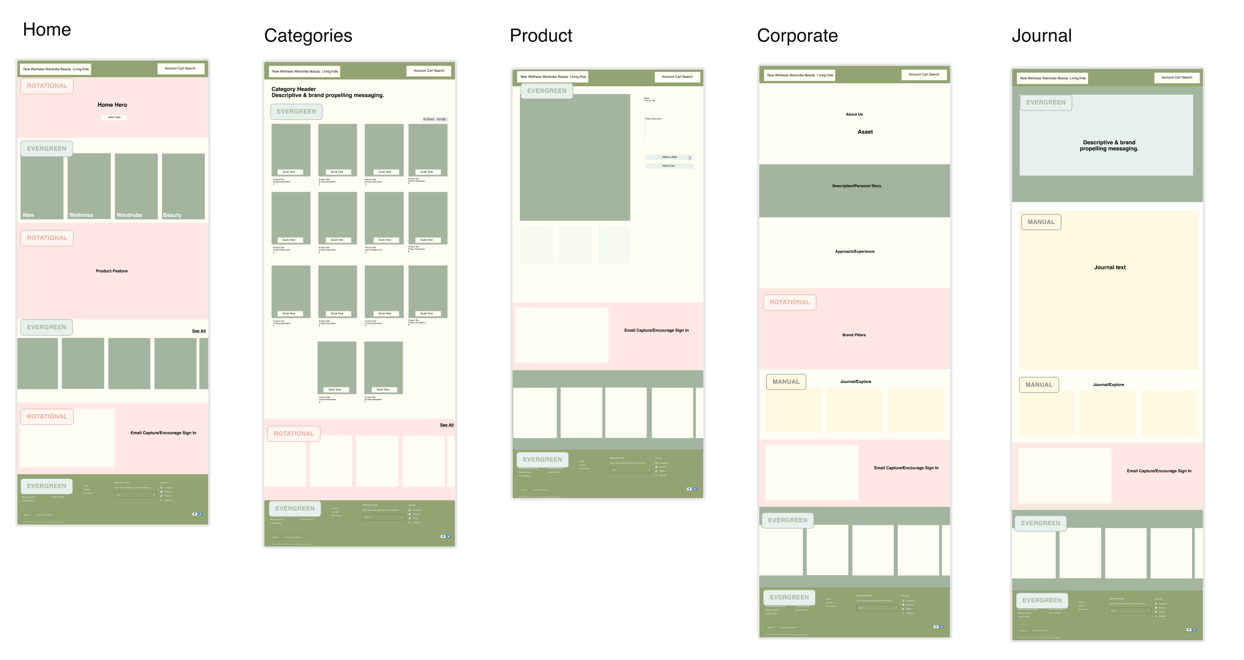
Each template breaks into components, and every component maps to one of the three zones. That mapping is what lets most of the site run on its own.
Each zone does a different job. Evergreen holds the static brand and structural UI. Rotational pulls automatically from product and recommendation feeds. Manual is the work a person still owns: hero messaging, curated stories, and promotions. Most pages lean on the first two, so the site mostly keeps itself current.
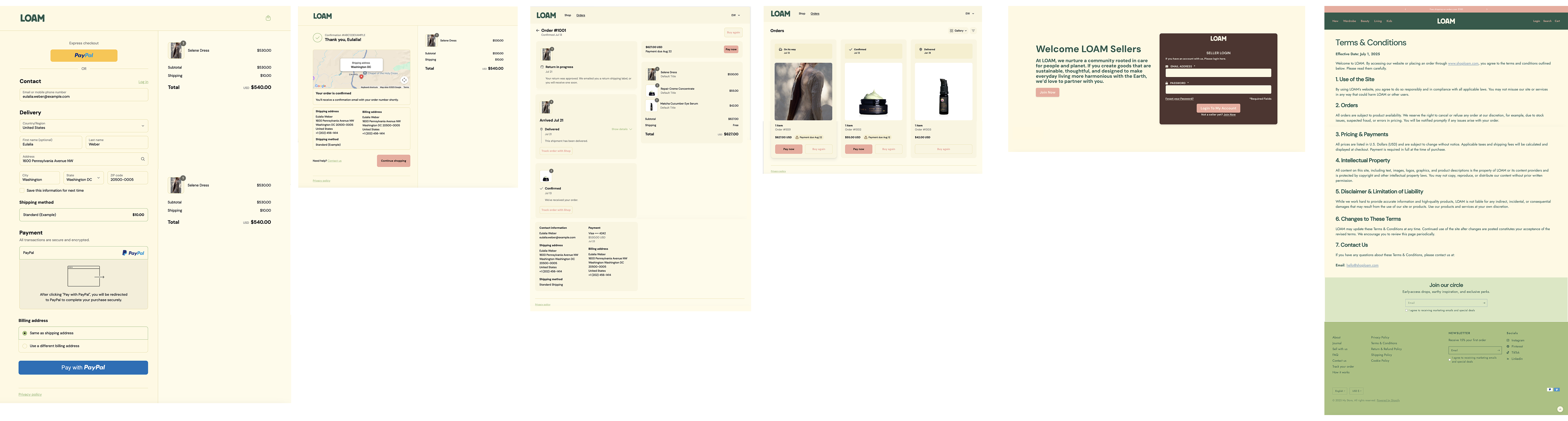
With the structure in place, I moved into mid-fidelity to test the highest-stakes moments: checkout and order confirmation for shoppers, order history and seller login for vendors. Walking these flows surfaced the states and edge cases the components would need to handle.
40+ reusable components, one coherent brand
The system grew to 40+ reusable components across storefront, seller portal, and marketing. Building each piece once and reusing it everywhere keeps product and marketing reading as one brand, even as we add new surfaces.
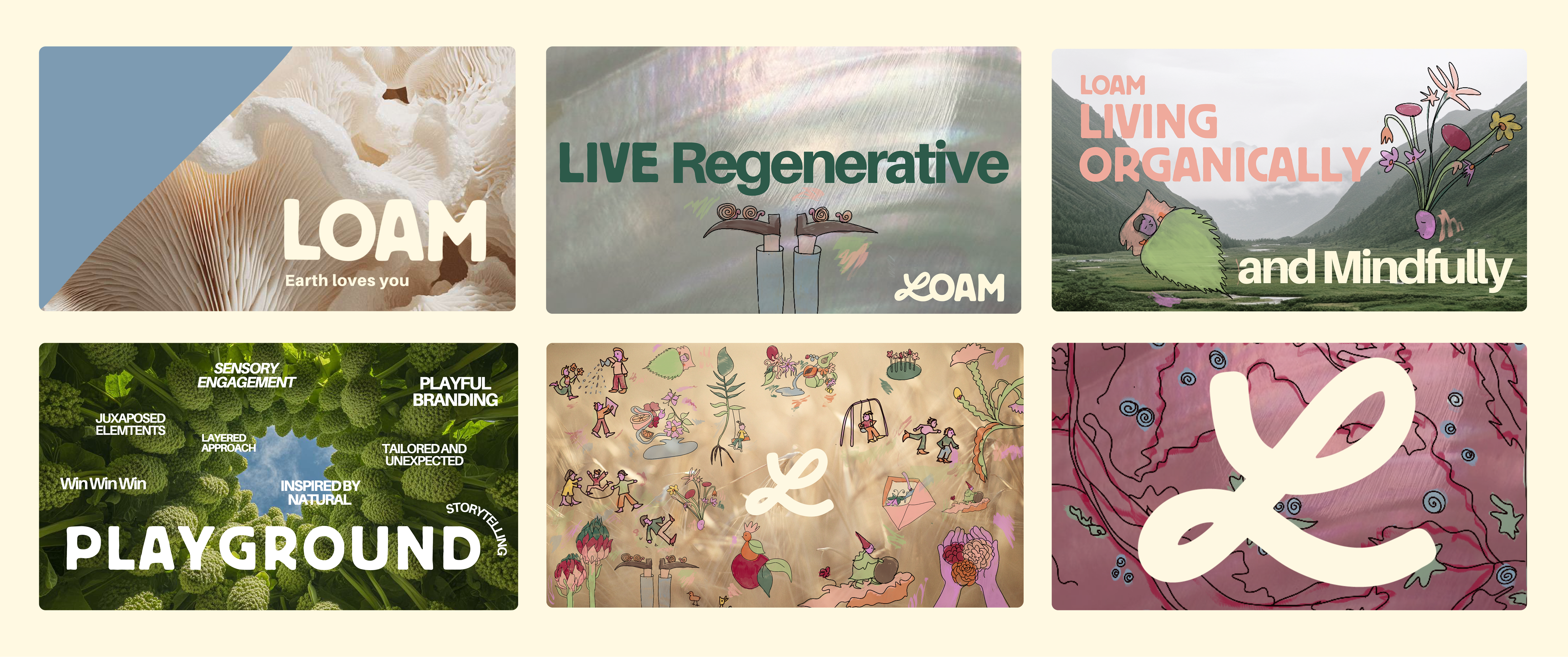
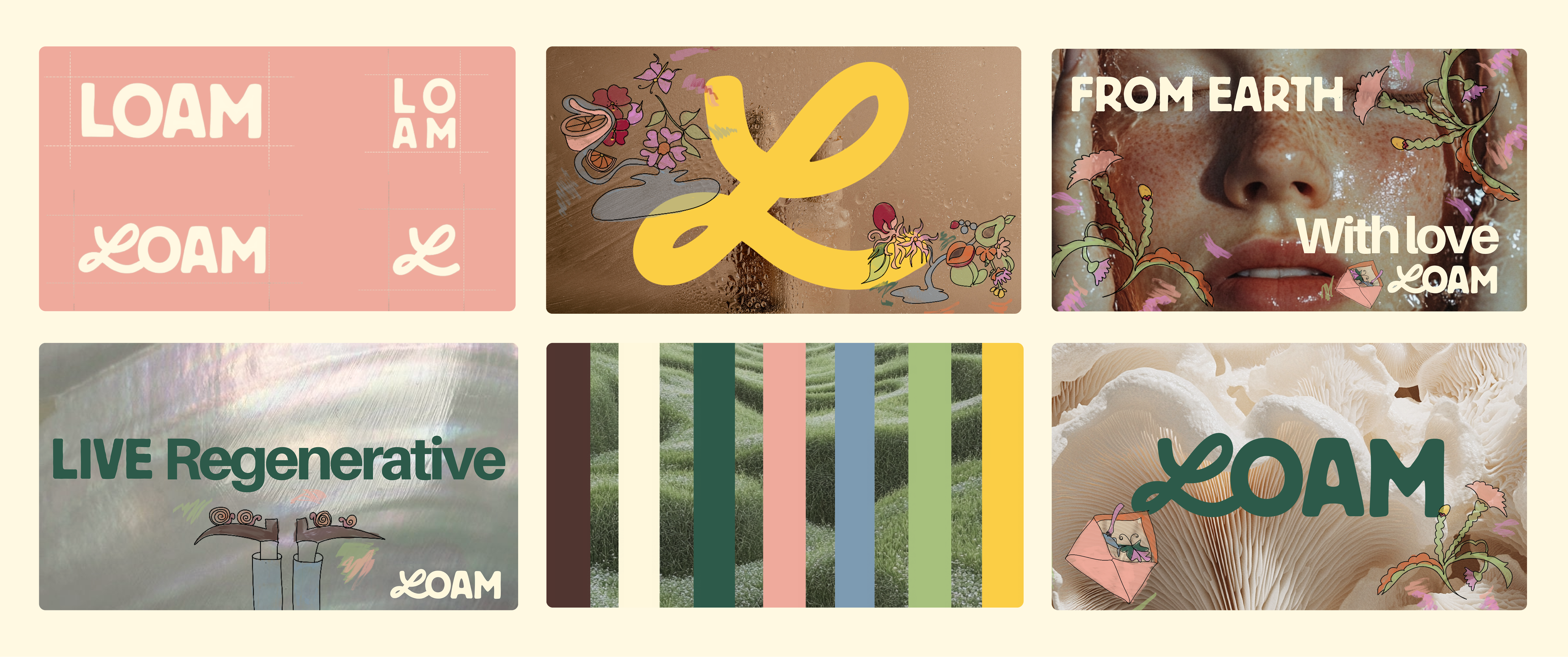
Brand identityThe identity is warm and aspirational, built around "For Earth, With Love." Type, color, and imagery feel premium and considered without getting clinical, so the brand stays easy to trust.
Designing the seller and shopper journeys
I owned the core workflows for sellers and shoppers: vendor onboarding, the seller portal, product listing, shipping and returns, and the path from discovery to checkout. I also built the category system of four departments and about 25 subcategories.
Loam runs on Shopify Collective, a proven base for the hard infrastructure: payments, vendor payouts, and order routing. I built the Collective integration and the front-of-house on top of it, with engineers Lokendra and Sakshi smoothing out the edge cases along the way. We ran remote and async, handing off Figma specs and trading work until design and engineering lined up. Leaning on Collective for the plumbing is what let a small team ship a marketplace this complete.
Navigating engineering constraintsNot everything I designed survived the platform. Collective couldn't customize vendor onboarding the way I'd drawn it, so we reshaped seller setup around what it gave us, keeping the low-friction feel where it mattered and dropping the steps that meant fighting it.

The constant tension was curation versus scale. The brand depends on everything feeling hand-picked, but opening up to more sellers pulls toward volume and mess. So I put the rigor into the system itself: components, templates, and guardrails that hold the bar. A new vendor can join without watering down the experience, because the structure does the editing a person otherwise would.
One marketplace, built to scale
Loam is live. We run 300+ independent vendors across 4 departments and roughly 25 subcategories, each shipping direct from the maker under one brand and one design system that hold up as sellers come on. That consistency rides on 40+ reusable components underneath, so the experience stays coherent as the catalog grows. The full operating layer shipped with it: seller onboarding, product management, order tracking, and a returns flow that connects shoppers to the brand they bought from. Early orders are averaging around $142.
Takeaways
Building on the right foundation
Building on Shopify Collective meant I didn't have to rebuild payments, payouts, and order routing. That let me spend almost all my time on the experience and brand, the parts that set Loam apart, and still ship something this complete with a small team.
Systems over screens
The win was never in any single screen. It was the model underneath, a small set of content rules that let the site keep itself current. Designing that first is what let a small team ship something this broad without it falling apart.
Balancing curation and scale
Curation and scale look like opposites, but they don't have to be. The trick was building taste into the structure, so we could bring on far more sellers and still feel hand-picked. That balance, more than any screen, is what I'm proudest of here.
Working as a small team
A remote founder and two engineers shipped something this broad because we stayed close and moved fast. We didn't always agree. I wanted returns to connect shoppers straight to each brand; the engineers worried about order routing. We kept the connection and simplified underneath.
What I'd design next
Now that Loam is live, the clearest next problem is the gap between discovery and cart. Shoppers arrive and browse, but the path from interest to a first order is where we lose them. I'd focus there: sharper product storytelling, stronger trust cues, and a smoother entry into checkout, built into the system rather than patched screen by screen.